
In my final technical communication class, I was asked to craft a white paper that educated an audience on a crucial civic issue. I chose to help citizens of Fulton County, GA understand and navigate misinformation, election integrity, voting systems, and their own democracy through thorough research and strategic document design.
One of the most exciting aspects of this project was learning the genre of the white paper, as this was the first time I was asked to produce one. The main purpose of the white paper was informing, so I needed to decide what information was critical as I sought out the most accurate and recent data which affected voters' participation in government. I also needed a large spectrum of information– content ranging from how government operated to content about hot topics that could be heavily misconstrued in social media. I didn't design the document, itself, though, until I translated my research into my own words. Designing the content, however, proved challenging: how much should I include and how should I share it in writing?
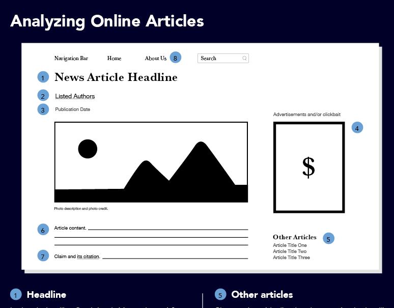
While I was working to balance the brevity and clarity of my message, I needed to convey information to voters with variant knowledge but in language that wasn't condescending. As a technical communicator prioritizing helpful, relevant information, I also needed to interact with potentially "triggering" topics. After all, content like misinformation affected how my audience viewed, interacted with, and participated in democracy most. My solution to these challenges, then, was adopting a neutral, accessible, and fact-based tone that shared content without stirring up animosity. After I honed in on the content, I worked to design how my audience navigated it, breaking up this text into sections and paragraphs and labeling those paragraphs for easy navigation. The next phase was designing a layout that would balance out the text.
My audience needed elements that could alleviate the weight of text on the page, so I retained a large portion of the white space on the layout. I also created more balance by including visual interest through photos or original infographics that echoed and illustrated processes or statistics in the text. Much of this visual design phase, too, was branding the GDC, creating a democratic color palette, making text-arrangement rules, choosing readable typefaces and fonts, and implementing relevant, professional imagery that supplemented the text. The final document, through its research, tone, and visual design, helps Fulton county voters by giving them accessible information and tools to navigate a tumultuous political climate.