In one of my favorite undergrad classes, I was asked to identify and re-design a brand by creating an original logo, mock website, promotional event, and a complete style guide for the brand. Living in Atlanta, I chose an on-campus bakery that I felt needed a refresh.
From Highland Bakery's website
The logo above is the original logo of Highland Bakery, a trusted bakery in the area of Atlanta. Even with all their history and recognizability in the city, I decided their logo could use improvement; I researched who Highland Bakery was, and I decided they could communicate the same care for their customers in a more fresh and relevant way. I wanted to help them stand out more, first, through logotype.
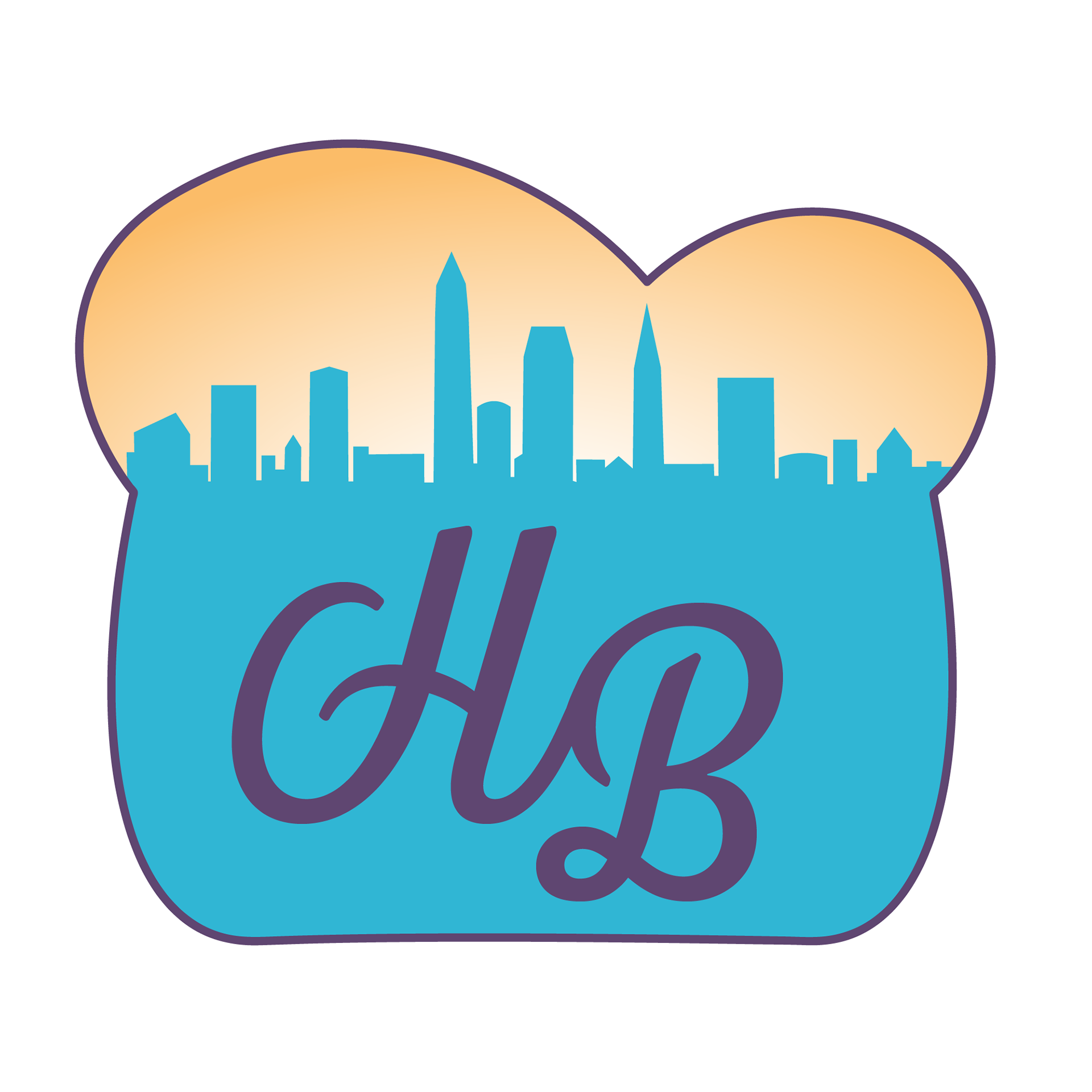
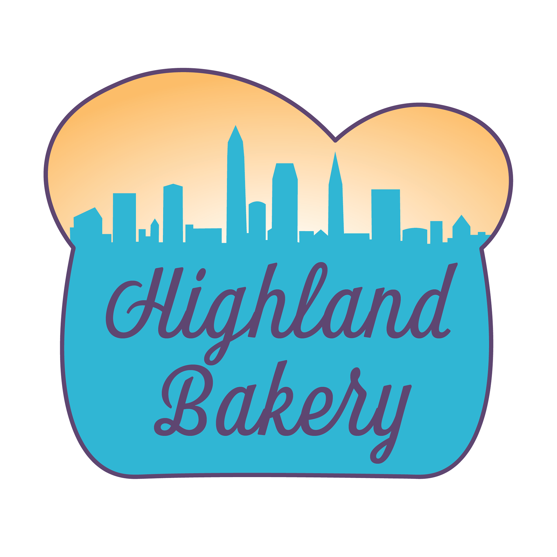
As I iterated, I found I wanted to remove the duller brown. I chose a blue that's positive and replaced the green with an elegant and energetic purple. I also used a neutral khaki that embodied the bread idea and contrasted with the purple. My goal in designing the two versions of the logo below was to communicate the company's friendly interaction with Atlantans through a lighter, more inviting color palette. My final design adopts the more granola tone of their marketing emphasis while maintaining their unique metropolitan focus, heritage, and reputation.
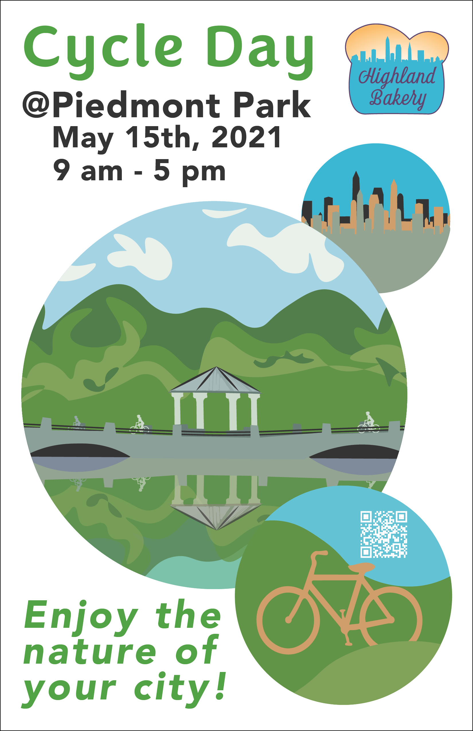
In the second part of the project, I designed a mock Highland Bakery event and a poster for that event, showing how the new visual brand identity interacted with the same audience. I incorporated all the elements outlined in the style guide, including the logo, font choice and color. I also created the event, itself, to cater to the more middle-age/metropolitan audience that would frequent Highland Bakery by creating a healthy, potential-family activity. Beyond making a wholesome activity that would reflect the brand, I could reach this audience visually in Highland's approachable tone by centering the visual elements around familiar, endearing Atlanta landmarks– like piedmont park's gazebo.
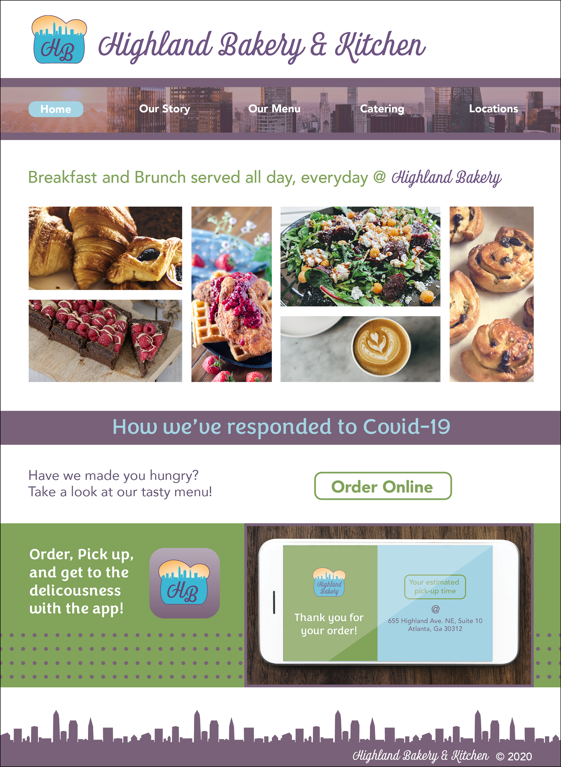
Like the poster, I designed the mock website to follow the constraints of the new style guide, using the new color palette and font guidelines. In a broad sense, though, I also aimed to faithfully represent the new brand in the digital space: through simple, friendly, and colorful detail. In this visual website prototype, I researched similar brands' websites and, in light of these, I designed a new visual treatment that incorporated relevant UX/UI tech–like ordering online or through apps. I also designed the website to continue visually acknowledging the brand's Atlanta heritage by incorporating a skyline in the central navigation bar. In keeping with my original goal, I wanted the new website's elements to surpass Highland's current website through more informed, vibrant, and relevant visual and UX/UI design.
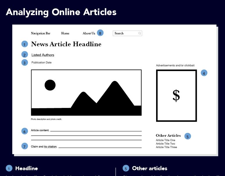
As the final piece of my Highland Bakery revamp, the style guide required more precision and detail than any other Highland asset I created before: it would need to thoroughly answer any design-related question in the light of Highland's new visual aesthetic but in a textual tone that matched Highland's brand identity.
I started creating the style guide by isolating my goal: After engineering the base document design, I would move to bigger questions; from defining the bakery's tone and vision, to inventing exhaustive rules which protected the brand, I tried to anticipate and assess every potential design rule's implication. After finalizing rules and organizing document spaces, I summarized each rule in Highland's defined tone, writing all the body-copy myself. The finished style guide, as a visual definition of Highland's new brand, includes all of the digital assets from earlier projects–like their new logo, website etc.– as examples in a cohesive, complete 7-page document.
The opening page introduces the guide, and the following pages demonstrate manifestations of the new design language in the tone defined by the guide. Click on the pages above to interact more deeply with a refreshed, yet faithful Highland Bakery design language.