
In addition to creating social media content strategies and white papers, I was also asked to design more prevalent technical communication artifacts that you see everyday– like a set of instructions or an infographic. In my final technical communication class, I was asked to create a document which combined both, helping Georgia voters how to spot misinformation and fact-check.
In this project, I was tasked with creating a document which helped my audience navigate something important but that also included infographics and technical definitions. I chose to take on the Georgia Democracy Coalition's (GDC) role and mission to help voters inform themselves again, but this time, I would help the reader spot misinformation through an instructional manual. The first phase was planning.
In fact, most of my energy on this project was directed towards planning: I had to put myself in the voters' shoes, asking what they needed to know and wanted to know from an instructional document, as this would shape what to write and how to write it. I needed to decide what to include and not include. Moreover, as a technical communicator, I was responsible for providing information that wasn't just useful, but helpful. Since information about democracy and voting was both online and on social media, I decided to make instructions for navigating these topics in both arenas. One of the project's parameters also dictated that I would also need to anticipate and solve my audience's potential problems. This was the inspiration for the offset "What if..." sections. These sections, in addition to visually balancing out the left-justified text, quickly troubleshooted the problems I thought would most likely pop-up during a voters' journey online. Next, I would write with voters' interests, desires, and knowledge in mind, researching topics for which I didn't have information or solutions, yet.
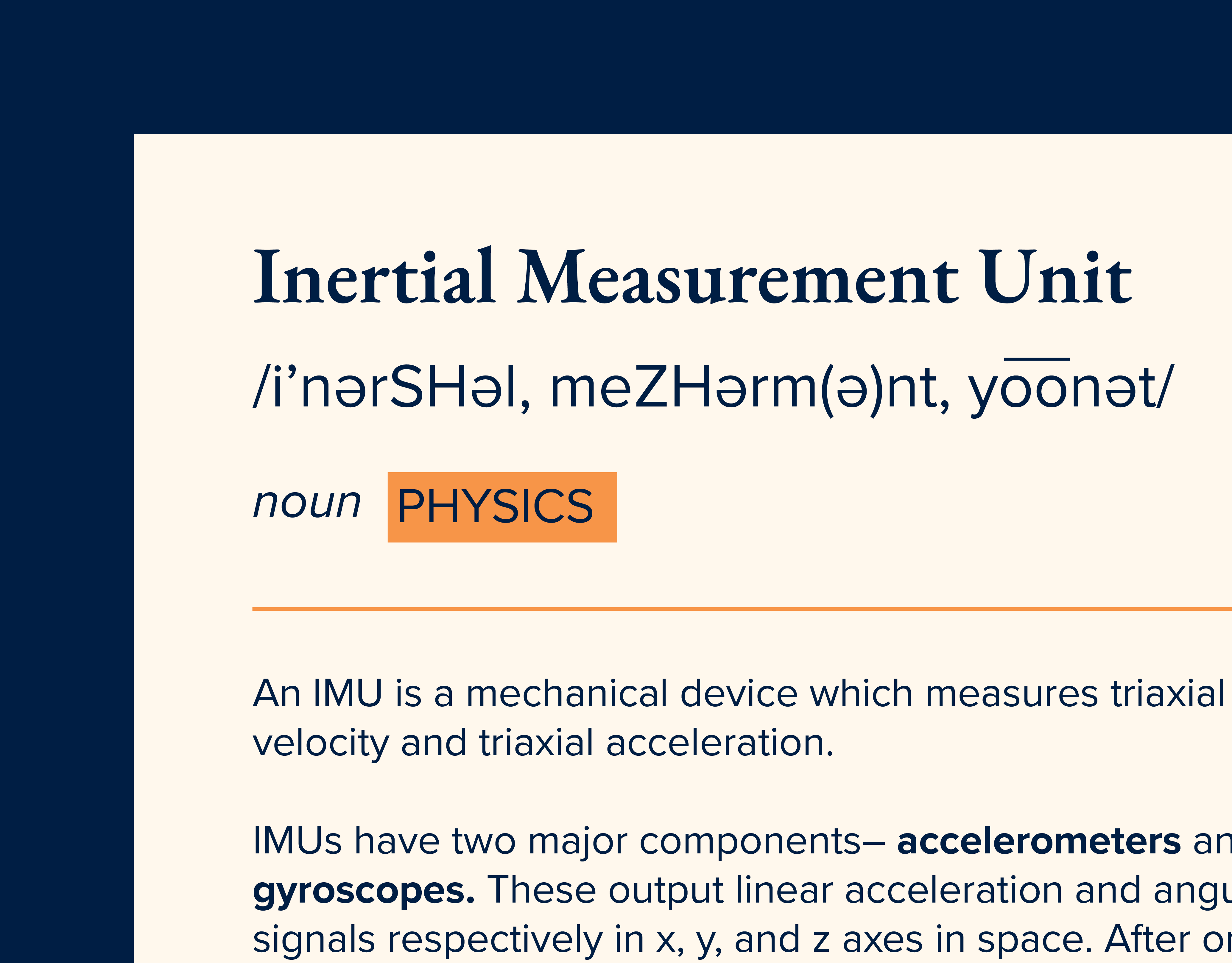
After I engineered solutions and incorporated my research into the body-copy of the project, Writing the text for each, I prioritized making the tone efficient as well as navigable. The last phase of my work was visually designing the information to best serve GA voters, and this meant creating relevant infographics which followed the GDC's branding. The Infographics needed to stand out from the textual information, also; to accomplish this, I tried to achieve maximum contrast against the white page by using GDC's navy or blue, and I created visually cohesive vectors in each infographic. The final instructions and infographics, then, were the product of multiple phases– including planning, writing, research, and visual design.
The full instructions document, complete with definitions, infographics, and sources, is available above.