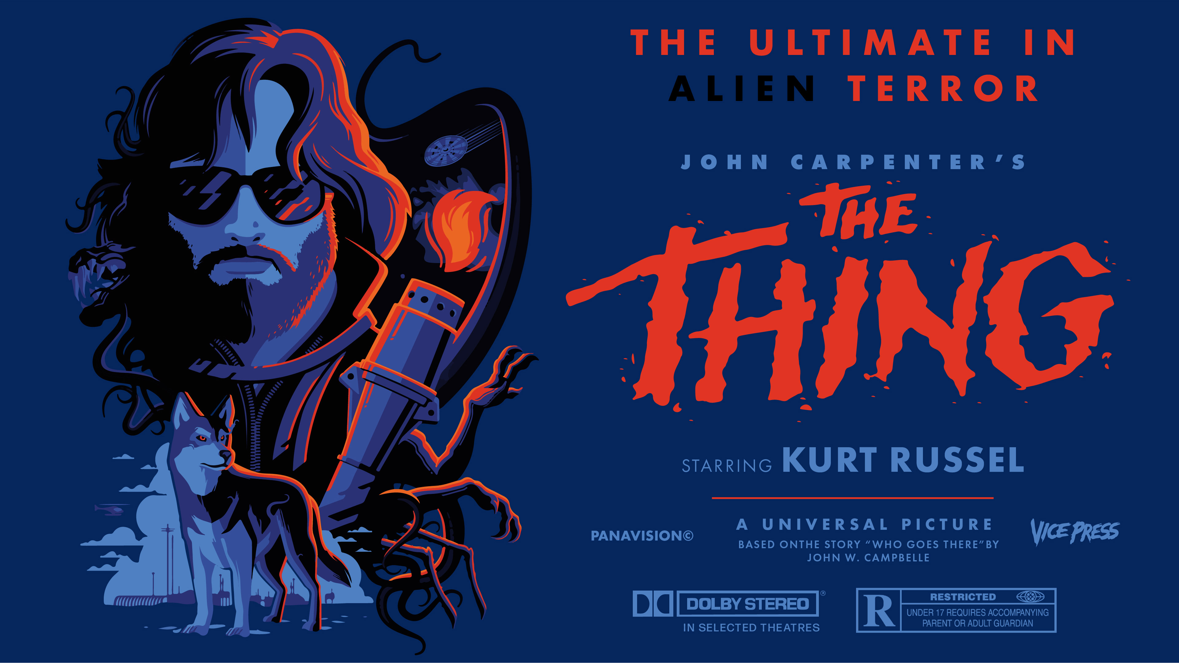

In a graphic design class, I was challenged to take a vector-based poster and rearrange, subtract, or add assets to fit the constraints and better communicate the message of the poster in four separate media-formats: horizontal and vertical phone views, a digi-sign view, and a billboard.
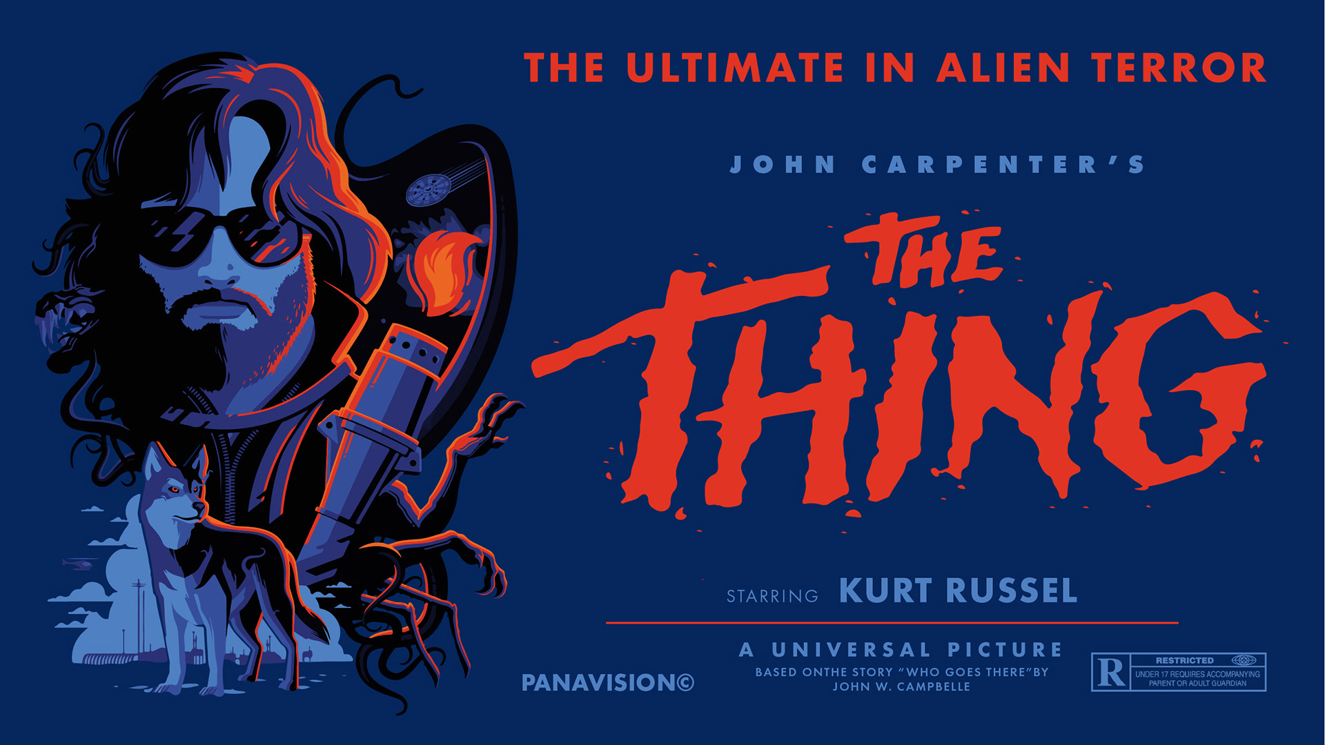
In this prompt, I was asked to convey the same message as the original motif (below), but I would need to prioritize information to better serve the user in 4 different formats/media: horizontal and vertical phone views (1440 x 2560 px), a digi-sign view (3840 x 2160 px), and a billboard (48 x 14 ft). First, I had to isolate the message. The message was an important media event of dynamic, iconic "alien terror," and I needed to account for how each user would interact with this message in the digital space given the dimensions and context of each one: I placed myself in the user's shoes, thinking about how quickly they'd be able to digest the information in each context.
Above is my solution for the billboard; here, I simplified the original display typeface, making it more readable than the original. I included and highlighted Kurt Russell's recognizable name in bolded blue text and the "alien terror" summary of the film in contrasting red text. In the centered placement, the vector broke up the visual space of the billboard in two, and this created a visual balance challenge for me; I decided to parallel the blue assets sandwiching the red assets on each side to create symmetry through color. To make the most of the limited time I had with the viewer, too, I clarified the original design, removing production information that wouldn't be pertinent to the user on the road. In my final design decision for the the billboard, I took advantage of billboard genres to work outside the constraints of the rectangle, making the iconic vector really pop out in thrilling, 3-D way at viewers as they drive by.
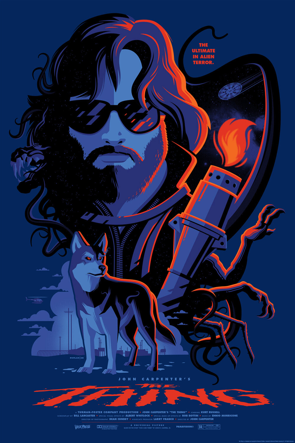
Original by Tom Whalen, Vice Press
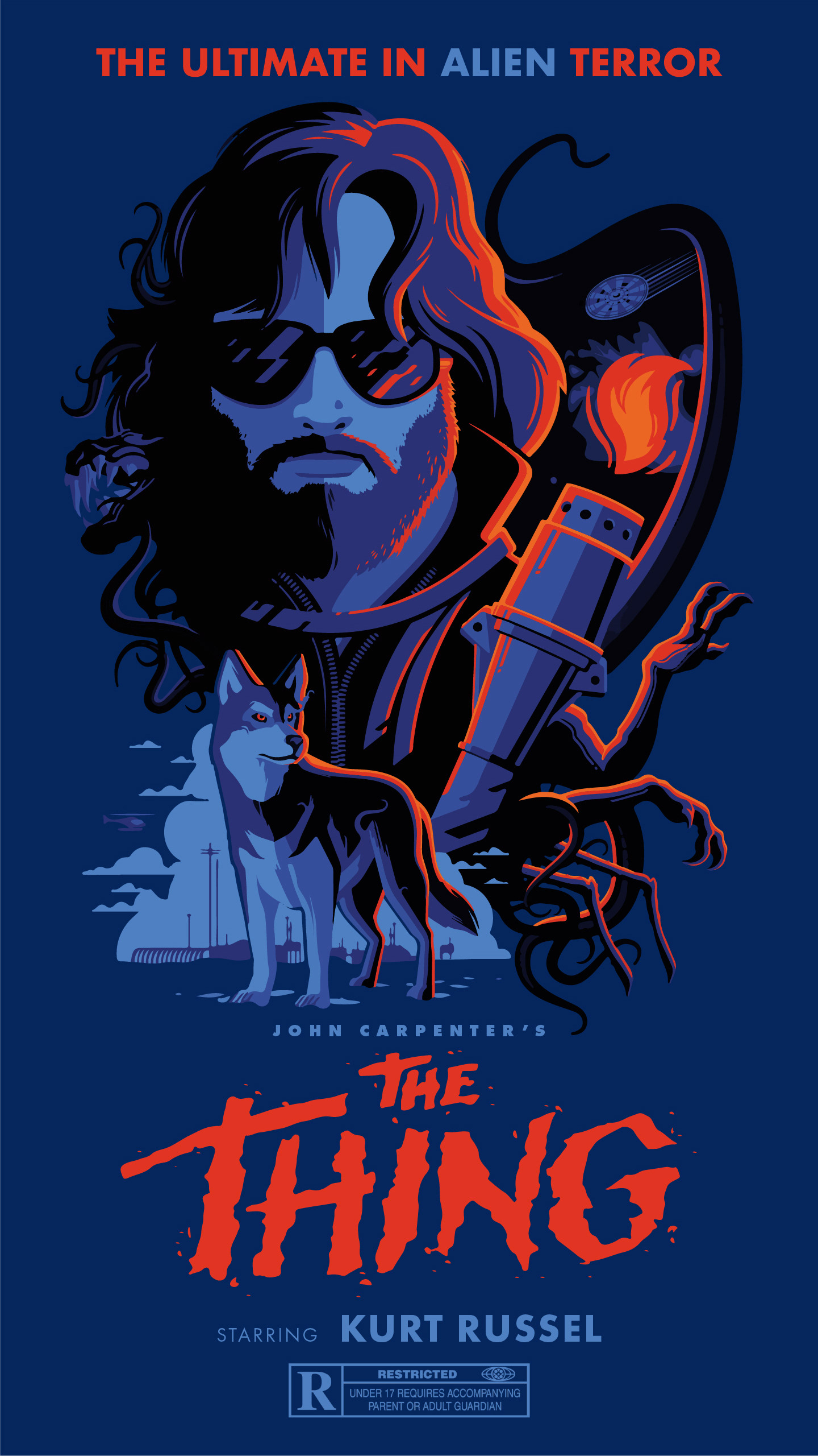
For the horizontal and vertical phone views, I needed to add/subtract information to serve users best in the context of being on their phone– scrolling on social media horizontally or vertically, how much would they actually look at or be able to see in a glance while still getting the original message? The answer was less information than the original, so I removed much of the production information in both. I made sure to include the film rating in each design solution, also, as a larger part of each design than the original. After all, this played a major part in each viewer's decision to watch or not watch the film.
For the vertical view (left), I highlighted the simplified display-type title, Kurt Russel's unforgettable role, and the "alien" aspect of "ultimate alien terror" through contrasting colored type. The contrasting blue "alien" acted to balance the visual interest of "the Thing"'s captivating title, also. I laid assets out vertically to capitalize on the short time I had with viewers in the fast-paced phenomena of vertical scrolling in media.
In the horizontal frame (right), I highlighted the whole of "ultimate alien terror" solely in red and Kurt Russel's crucial role in blue, but, in contrast to the horizontal view, I emphasized John Carpenter's ownership as a prominent director. Here, in a more appealing and captivating orientation, I had slightly more screen-time engagement than the vertical view. I took this leeway to credit the production companies while simultaneously using its text in blue to balance the eye-catching red-text summary and title.
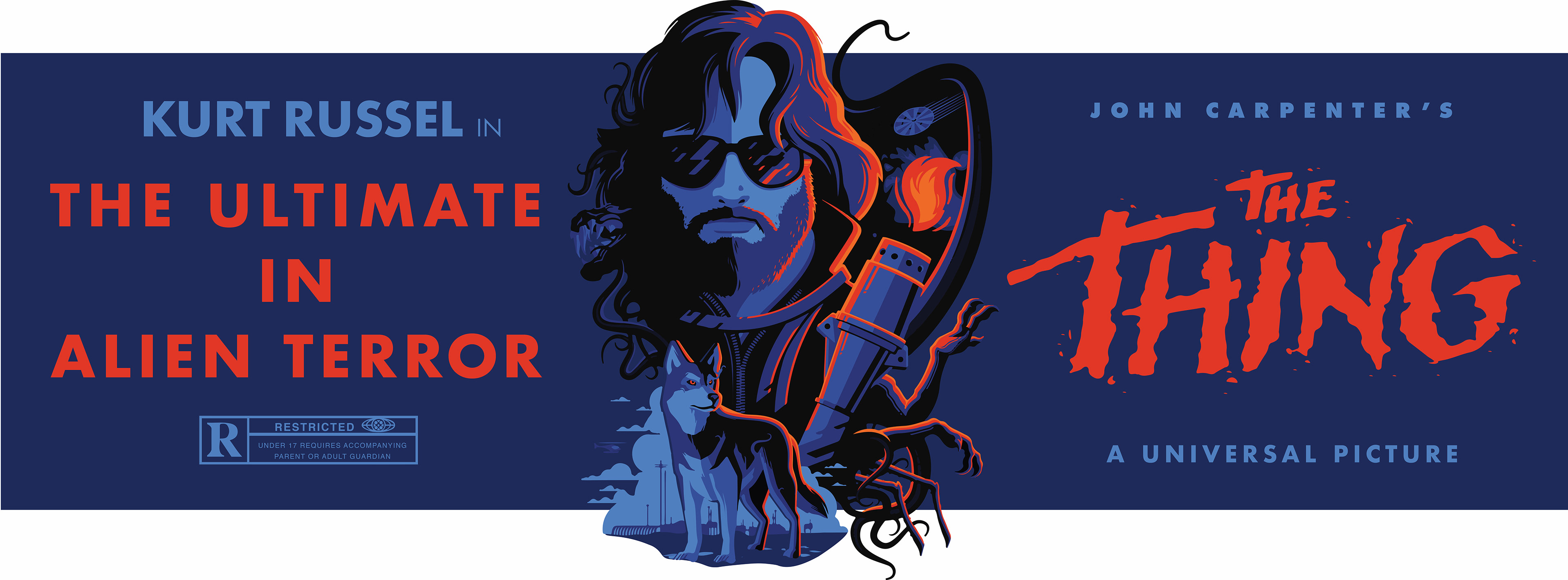
For the digi-sign, I had more real-estate and screen engagement time than perhaps any other medium before on this project. I took advantage of this extra space and time with the viewer, spotlighting aspects which might help sell the film in theaters– like the quality of the production and its use of Dolby stereo. I also highlighted the "Alien", but I did so by pulling out the black of the vector and contrasting it with the red summary text. In addition, I wanted the black to create more visual interest given that there was more text on one-side than in my other treatments: with more text and information in the context, the challenge was avoiding color monotony.