I was asked to plan and carry out a Covid communication campaign in a technical communication class. As a woman concerned for other women, I focused my campaign on mothers who were pregnant during the pandemic: I communicated my research on vaccination and whether it was helpful for mothers and their babies through two relevant media– a blog page and an infographic.
Unlike many of the graphic design projects up until this point, I would need to dip my toe into the world of robust technical information; I would need to learn how to research and translate complex information to the layperson, and this exceeded the scope of earlier projects whose focus was mostly solving visual problems. That's just what I did, but first, I needed to choose an audience and a problem.
As a woman who's always wanted children, I was really interested in pregnancy and covid, and I wanted to speak directly to woman dealing with covid in the midst of their pregnancy. I had a loose topic and an audience, but I wasn't sure what I would research/communicate yet: I would need to conduct technical research to isolate what exactly these women needed to hear most. After robust research, I had landed on important, relevant topic: the issue of vaccinations and what effects they had on pregnant women/their children. When I was working on this project (2021), pregnant women's health and the efficacy/safety of vaccination was a fairly new question in the medical community, but I found there was a growing body of research from which to draw data and helpful conclusions for women who didn't have the time, energy, or resources to do alone.
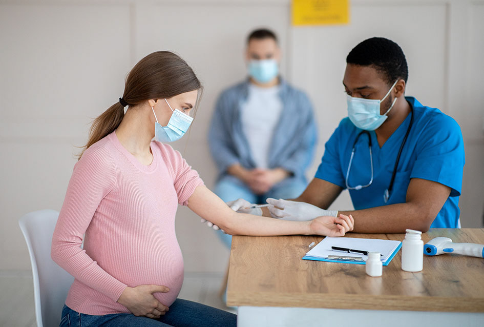
As a piece of technical communication, I wanted the information I shared to be useful: I wanted to give pregnant mothers piece of mind so they could know more than just what their doctors told them at an appointment. I was learning that technical communication was not just useful, though, it was also helpful– the shapes my message took should be something that they'd actually want to interact with. After thinking through different mediums and talking with my professor, I found a medium that was accessible and often popular among mothers online, the blog.
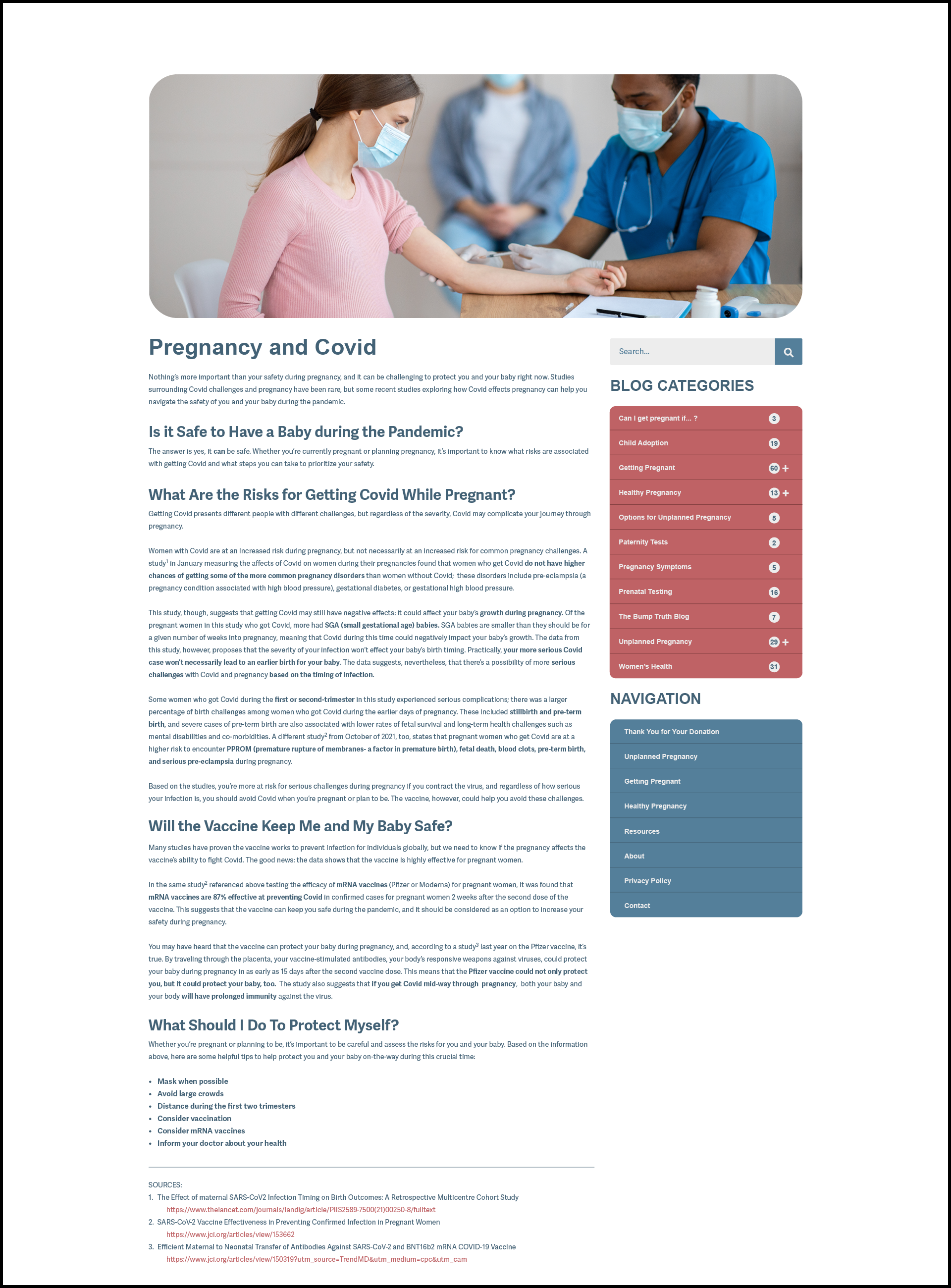
Instead of reinventing the wheel, my mock blog would become part of an already working website curated by the American Pregnancy Association, following its branding conventions, colors, and UX/UI. Though I wouldn't need to solve the problem of designing a platform on which to communicate my message, I was still designing the message: I would work to engineer the content, translating my complex data into accessible language, citing it, and arranging it so that pregnant mothers could understand it. Beyond strategically rewording, I used tenants of technical information design I had learned earlier in class to guide my process, splitting up the information into readable, accessible chunks, and sign-posting the information for easy scanning. I made the article helpful, too, by including the sources I used so that women with the time and energy could read the articles.
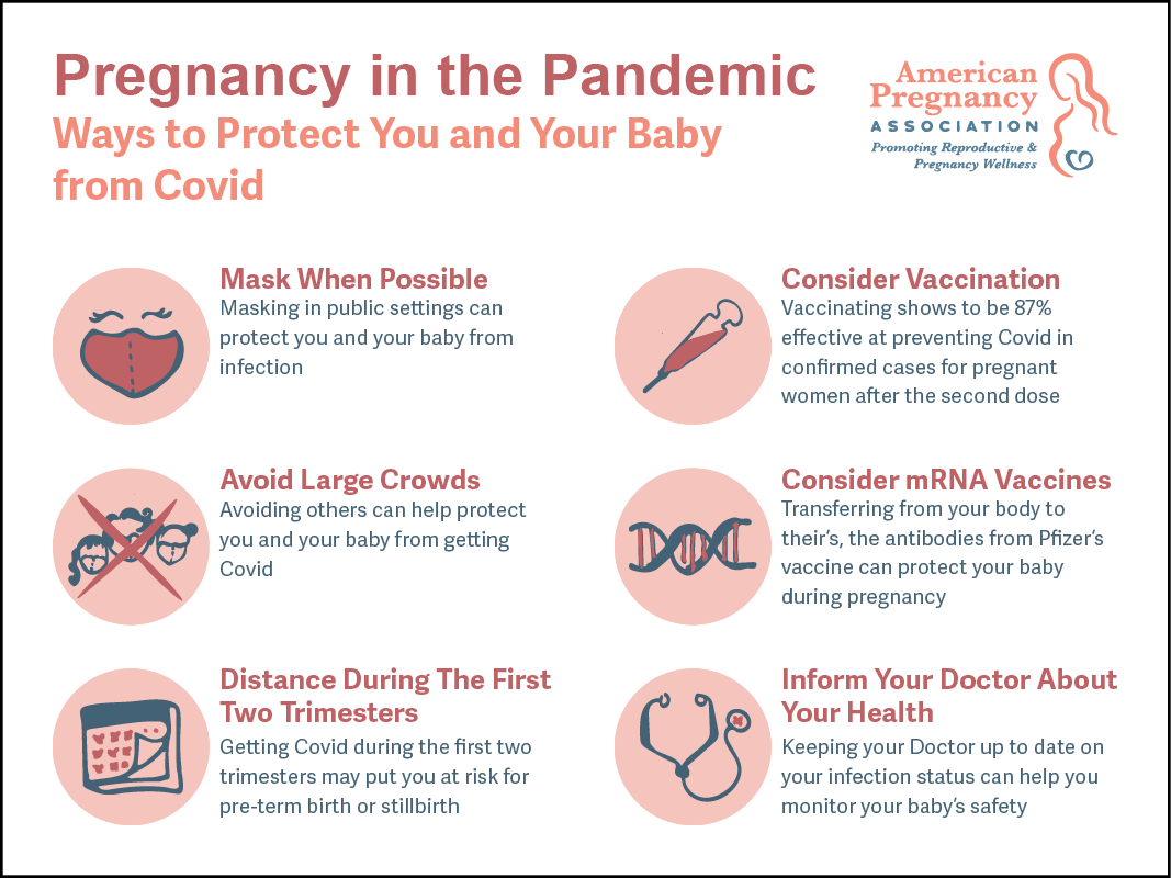
As the second deliverable in my covid communication campaign, the medium I chose would need to be accessible to my audience. It also needed to communicate lots of information without doing the same communication work as my earlier asset. What could communicate lots of data in a short amount of time? An infographic. This allowed me to hone my skills translating information into more visual but still technical information, also.
I needed to engineer a message from the data for the infographic, first. A helpful, realistic infographic wouldn't communicate too much information. Instead, it could tell the audience the most important aspect from a set of data. What was most important data to my viewer? The take-away of the blog- how to keep you and your baby safe during the pandemic- became the goal. The infographic I designed would still reflect the data that I had already translated, but it would require much more emphasis on visual aesthetic. I worked to create an infographic design language that interacted well with the APA's brand identity but stood out enough to highlight the information.
Next, I chose a color palette that adopted some of the APA's brand colors and expanded on them, making the infographic more dynamic and high-contrast. I also worked to boil down the information I had already synthesized in the blog into digestible bits that fit into a logical, grid-based layout. Like the blog, I would sign-post with bolded text, making it scannable for the reader. I would also try to keep the language of the text consistent: I would implement similar grammar constructions across titles and across body-copy respectively so that I could limit the strain on viewers. The final iteration helps mothers keep themselves and their babies safe as an independent yet cohesive supplement to the blog.