
Surrounded by STEM during my undergrad at Georgia Tech, I not only became accustomed to engineering basics, acronyms, and lingo, I also grew fond of them. It would make sense then, that now I relish every opportunity to become a subject matter expert and relay that information to an audience. This is especially true if the subject is technical or scientific. So, looking at controls engineering, this project became an ideal technical communication challenge for me. I identified my target audience first.
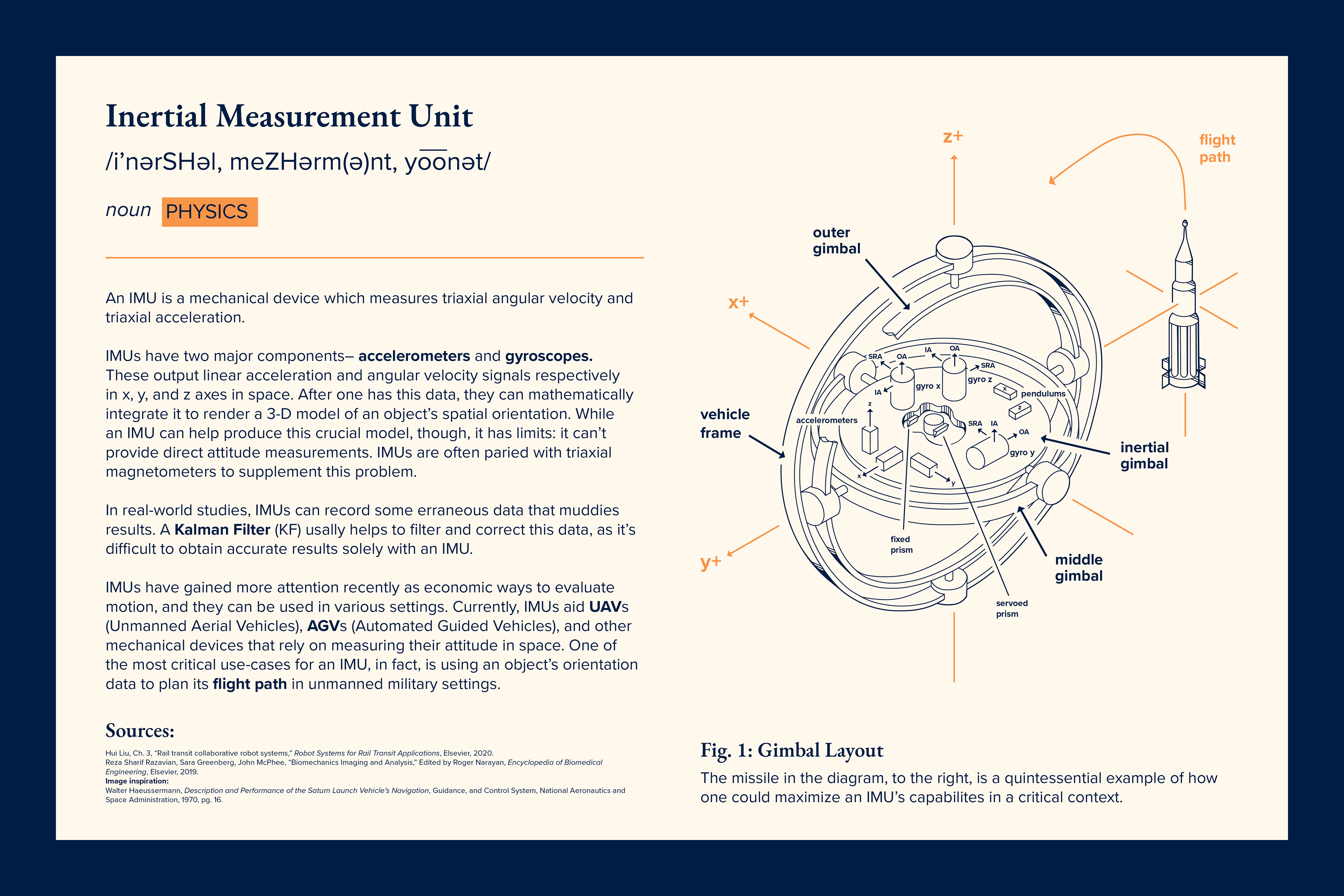
Next, I started thinking about the whole scholarly vision for the poster; to supplement the text I'd write, I needed a visual. I was able to find a clean, older IMU diagram from a NASA document published in the 1970's, Description and Performance of the Saturn Launch Vehicle’s Navigation, Guidance, and Control System. It beautifully illustrated the most basic IMU, one made of gimbals. Though I learned that IMU's have progressed since this document was published, I wanted this pure, simple illustration for the poster: it was the heart of an IMU. I took it, drew a new one digitally, and refined it in Adobe Illustrator.
For the textual, I researched IMUs and how they operated theoretically and in the real-world. I was able to find scholarly articles (listed in sources) which decoded how IMUs worked, but the tone was overly technical. After deciphering the information, I translated it into a more accessible, readable tone. I also isolated the most important aspects of this data; after all, my goal was to craft an informative, appealing 3,000 foot view of an IMU.
I handled the informative aspect, but now I worked on the appealing part, choosing the fonts and colors and placing all of the assets. I worked to create visual interest through a complementary color scheme– a deep base of navy and a pop of orange– and I added a brighter, orange hue to communicate the excitement flight control first had. I also chose fonts that, while studious, weren't visually too loud; the the information, itself, was most important. After balancing the textual and visual through layout, I had an IMU poster that was enlightening and nostalgic.