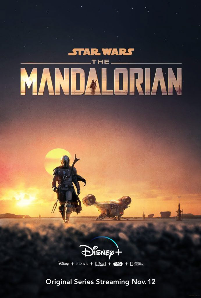

I was asked in one of my first graphic design classes to take a vertical poster, edit it, and make it into a landscape poster while retaining the original message. An avid Sci-Fi fan, I chose the Mandalorian poster. This was my remix.
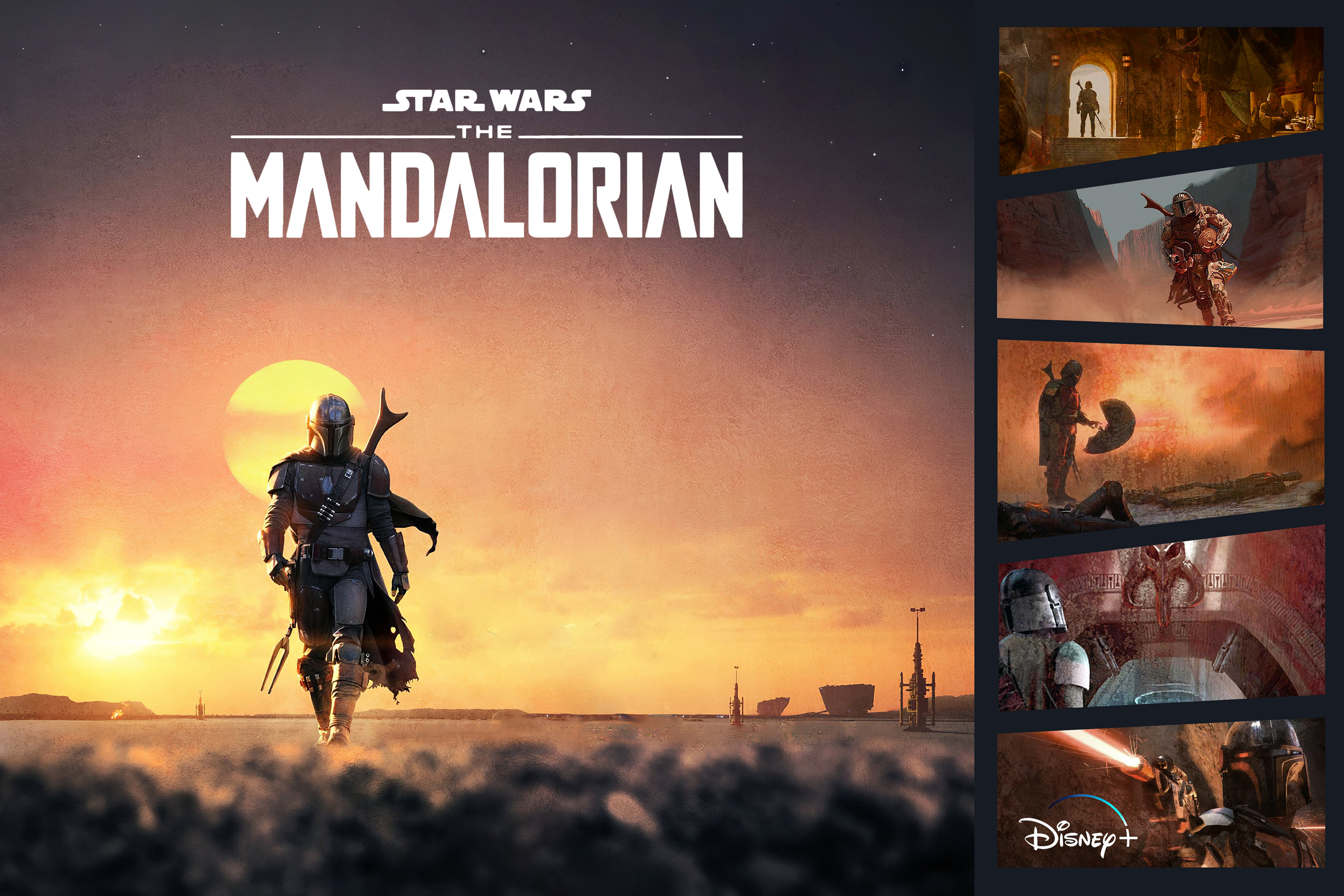
Passionate about Sci-Fi, I didn't take me long to gravitate towards Disney's production and promotional work from The Mandalorian. But how would I make it landscape and my own? As I was solving the problem of making this poster landscape, I had a realization: it seemed clear the show wanted to explore the wanderings of an alien lone ranger type. I decided to tease out his solo expedition more than the original, and through extensive Photoshop processing, I removed the ship from the scene. I made Mando, himself, a stronger focal point.
I was still met with the creative problem of landscape, though. I isolated what aspect of the poster to hone in on, but I didn't have enough of the poster's visual real estate to fill in a full landscape. I decided I needed to add some content to the side to supplement my vision and balance out the main scene. To create visual balance, I incorporated the phenomenal concept-art collections from the credits scenes to create a whole new scene with the same message. Recolored, cropped, and strategically arranged, these vignettes played into a familiar comic book trope which didn't alienate itself from Sci-Fi conventions. After shifting the focus of the original poster, I also needed to make the Mandalorian title just as dynamic/readable as the original, but the best place for it didn't offer enough contrast to use the original title. Changing the title from a hazy landscape scene to full white, next, I was also able to reinstate a dynamic title while simplifying an otherwise busy visual message.
Through all these decisions, I wanted to highlight Mando's almost Western, galactic finesse, while honoring his legendary status in a satisfying rendition of the original poster (below).