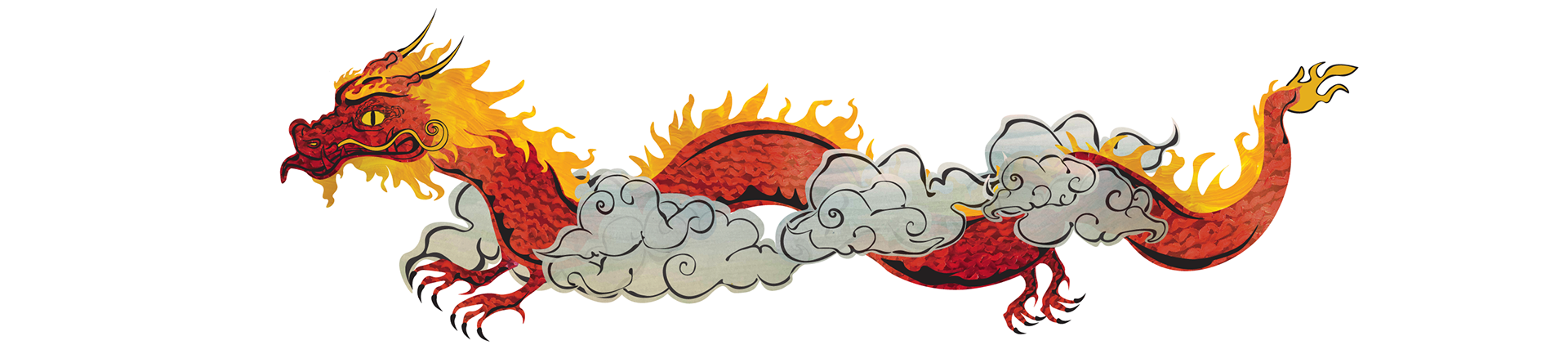

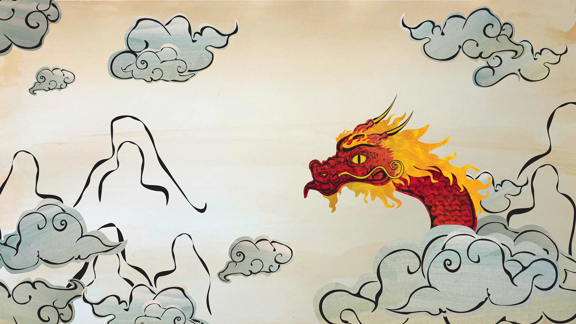
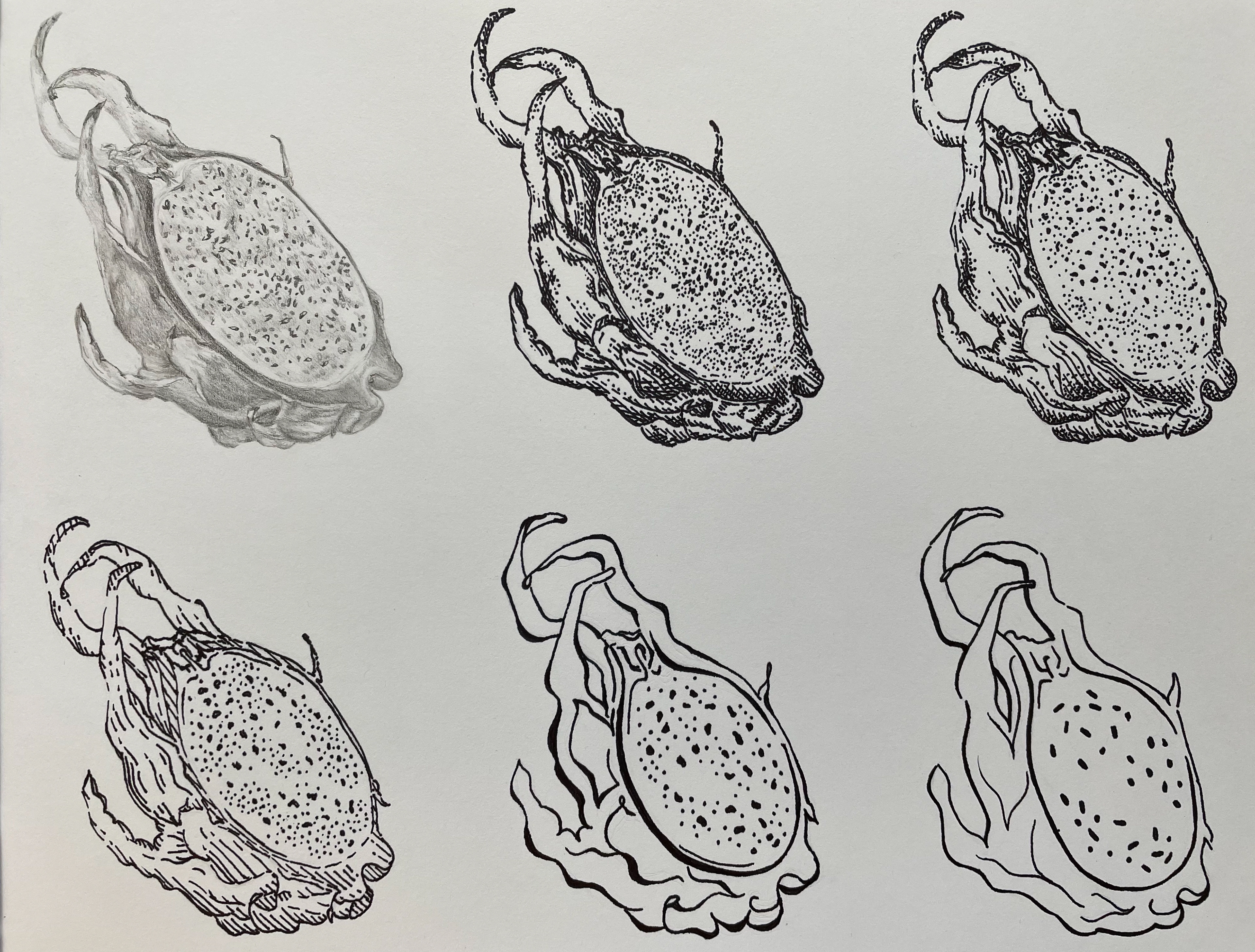
Before I made the Red Dragon into a book cover, shown above, it was an elementary asset I created for a basic design prompt, taking an ordinary vegetable or fruit and reducing it into an icon in graphite and Sharpie pen. I chose a unique and challenging fruit, the dragonfruit, and I boiled it down to an asset that communicated the essence and nature of a dragonfruit without the need for intricate detail in 6 phases. The photo of my original translation of the dragonfruit is below, the first iteration in graphite, and the rest in thin Sharpie, then thick Sharpie pen.
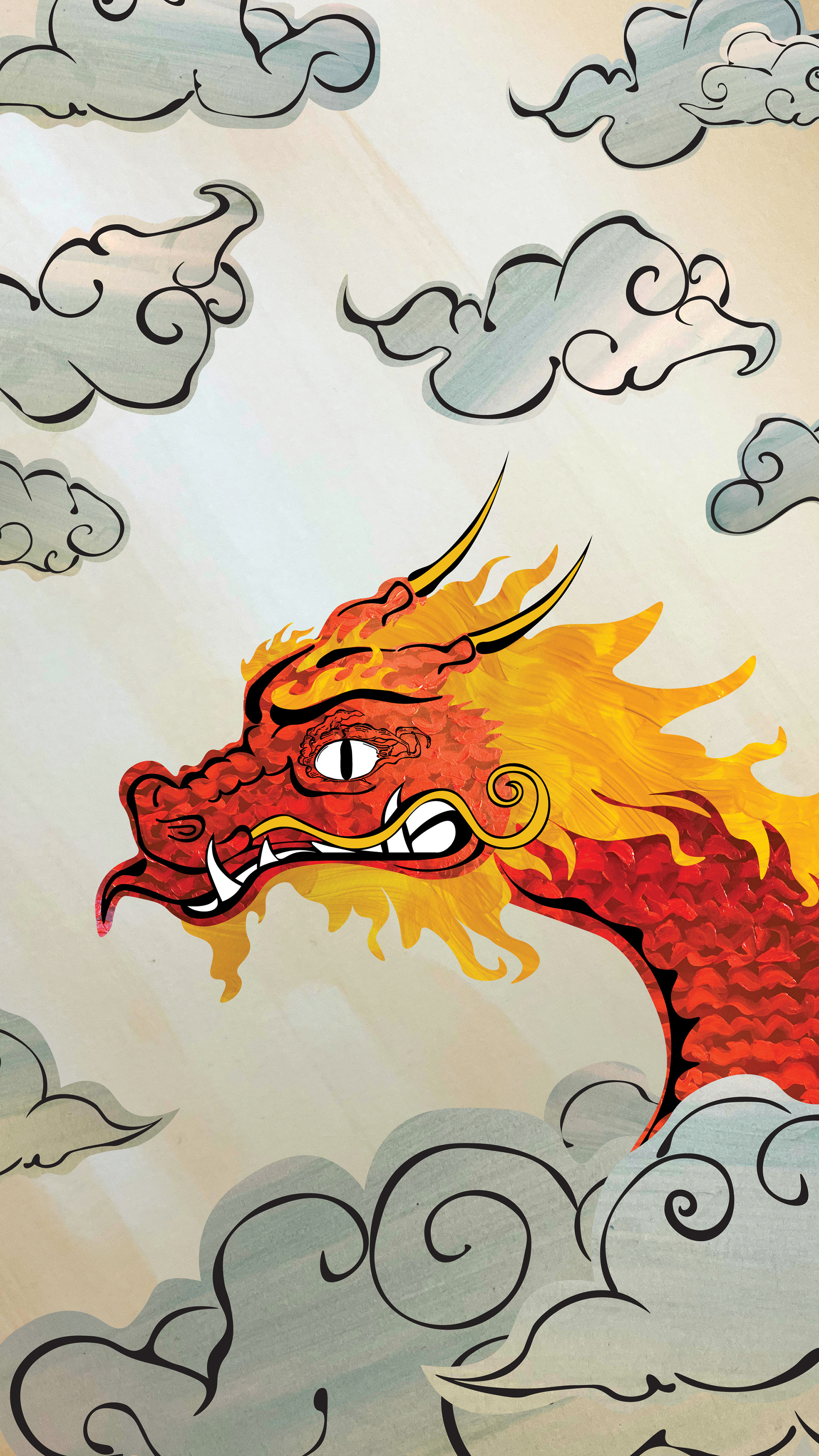
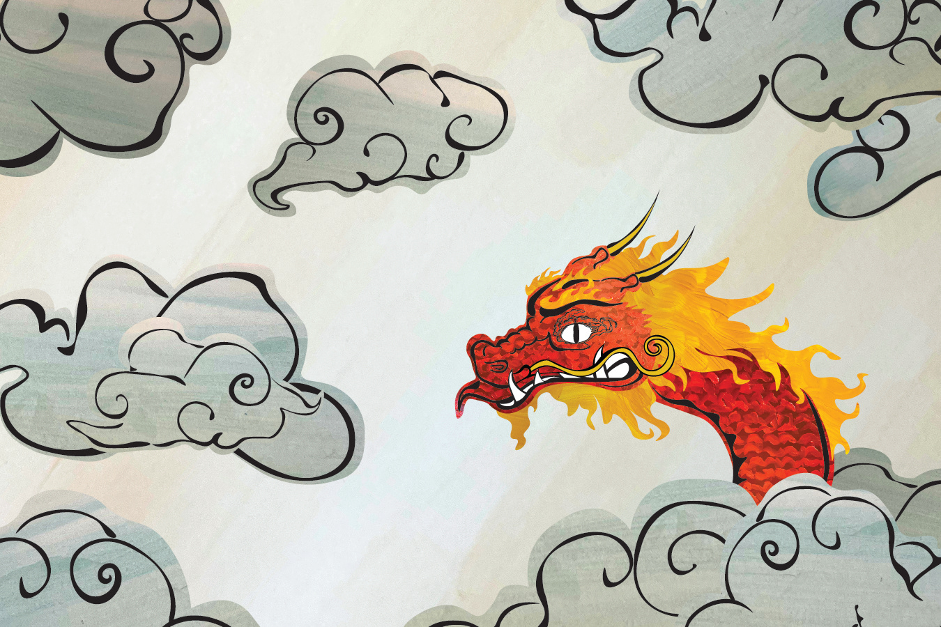
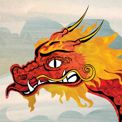
In the next project, I was asked to take the analog motif in Sharpie and create three composite compositions which included the motif and other painted elements. To meet the challenge, I converted the motif into an east-asian inspired dragon as the base for all three works, making his dragon eye in Illustrator from the original, simplified analog dragonfruit. I also used physical paints to create his scales, mane, and the asian watercolor-like background textures. I, then, reorganized the assets to fit three separate formats: one for Facebook post dimensions, one for a physical book cover, and the last for a pop-up ad. In keeping with the original prompt, I strived to translate my original work into to different contexts while still retaining the focal point of the original idea: the Dragon.
The Facebook Post
The Book Cover
The Pop-Up Ad
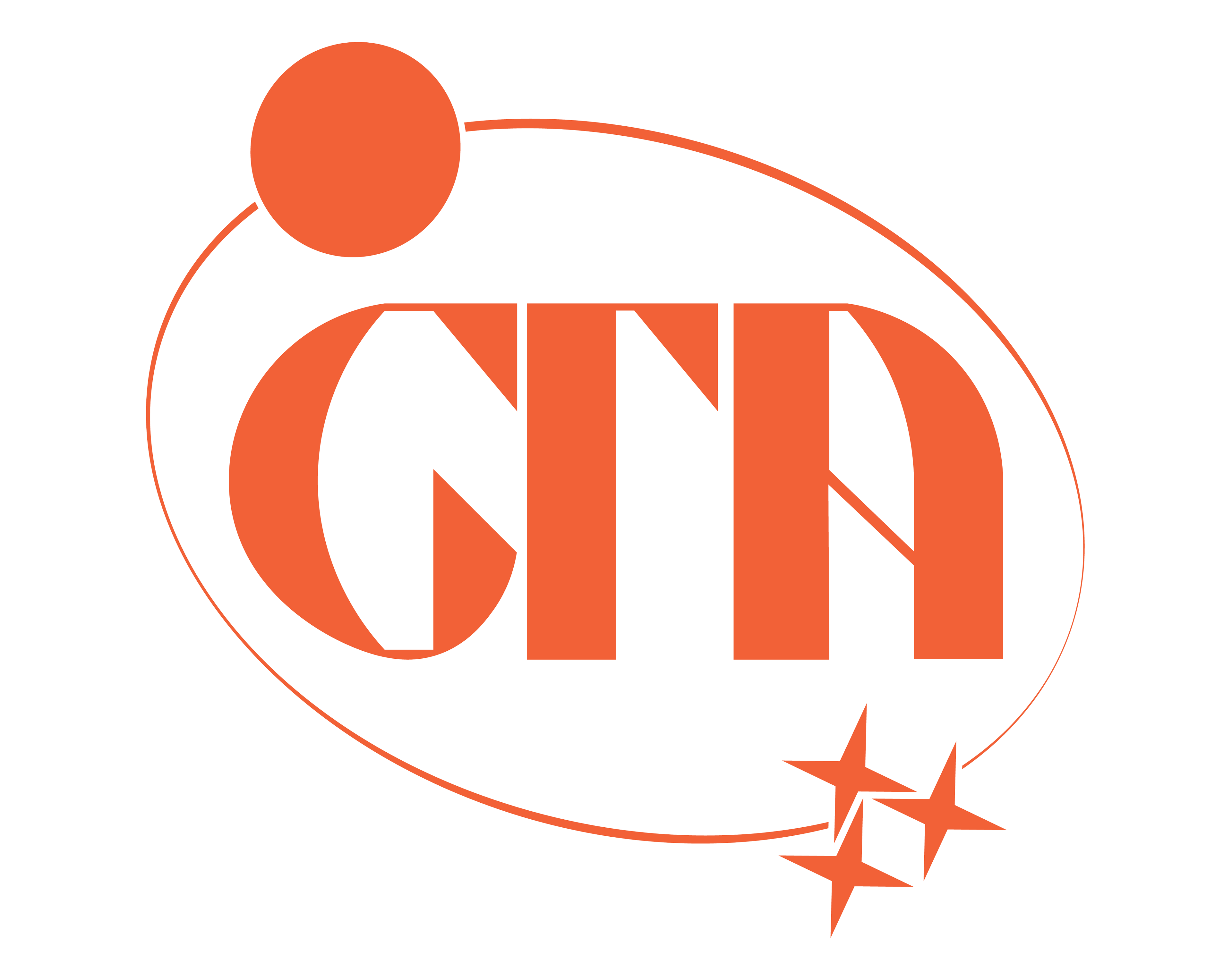
In the second project of our graphic design course, I was asked to design a user interaction, an experience with my fellow class mates. We chose continue the project with the assets from my work with The Red Dragon, creating a new mock brand called The Red Dragon Coffee, a coffee company that took great inspiration from the Starbucks style guide but included original work for a mock website and a 3D mock-up of the inaugural store. I designed the logo to keep the vision of the original motif while creating something entirely new, recognizable, and iconic for The Red Dragon's brand identity. This meant simplifying the dragon by removing the texture in his mane and scales. The logo appears in two forms, below.
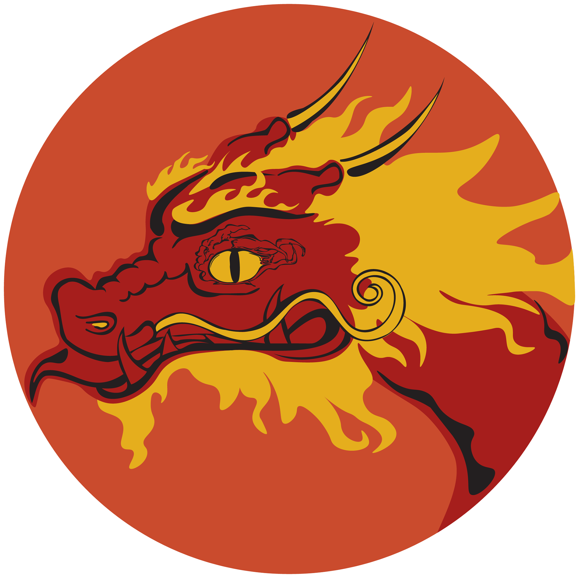
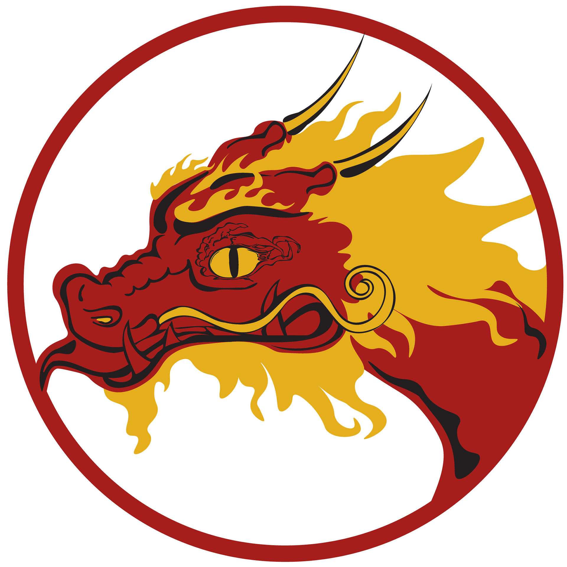
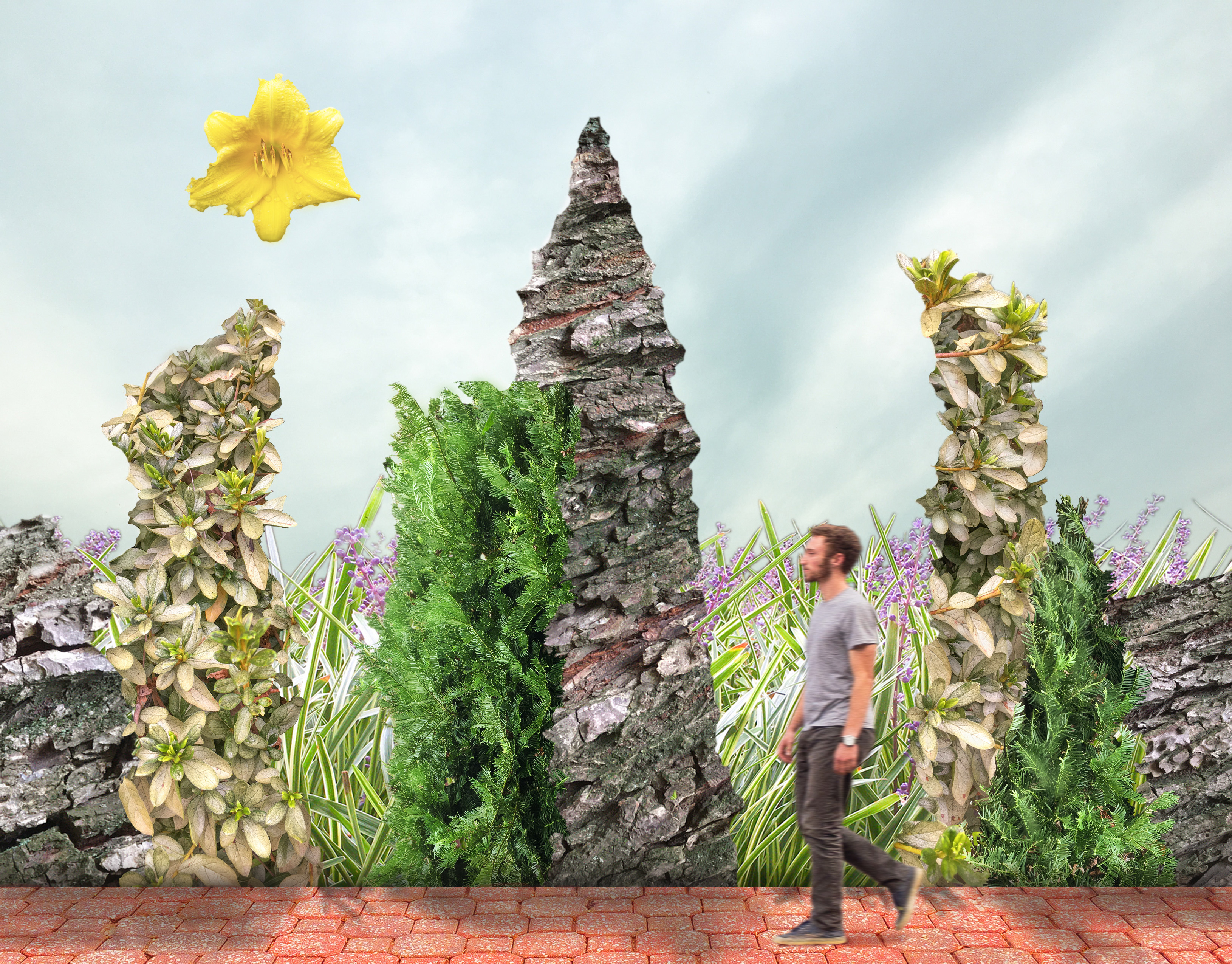
In addition to the logos as part of the Red Dragon Coffee's branding language, I created this motif to accompany the scene in the mountains for the mock company's website. The motif, as a more artistic expression of the brand than a logo, includes the original textures and shapes of the scenes I first designed while incorporating the more iconic, simplified mouth and eyes.