
My final project in a graphic design class, I designed the GTA (Galactic Travel Agency) as a travel agency brand of the future– when humanity has colonized other worlds. I was able to stretch my creativity by exploring iconic styles, sci-fi tropes, and brand design in my retro-futurisitic response to our class's final prompt, and I brought the GTA to life through three branding deliverables: logos, posters, and a complete style guide.
Using bureaucratic agencies like NASA as inspiration for the agency's logo and classic 60's hues to build its design-language colors, I strove to thoroughly design and present the GTA's brand identity. To believably communicate this identity, I needed to speak the media language of 1960's travel: vibrant print. I researched 1960's techniques/media to inform which printed genres to pursue, and my research led me to take on two pieces for the GTA after 1) the eye-catching poster and 2) the iconic printed brochure of that era. The piece below is my response to the former archetypal genre.
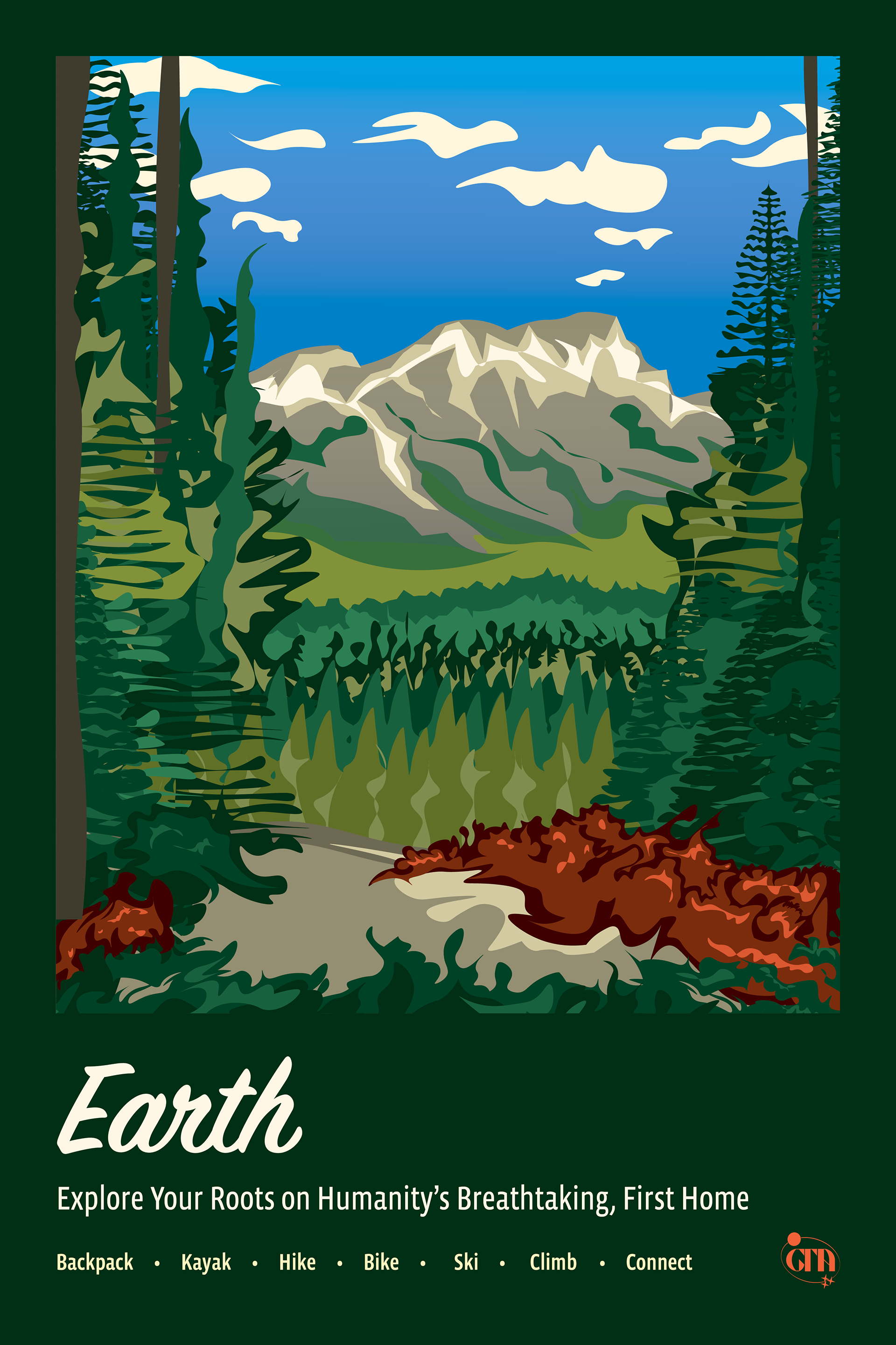
In this GTA poster, I catered to a retro-futuristic society, convincing them to come back to an Earth which was just as beautiful as when humanity traveled in the 50's/60's. In keeping with the logo, I looked to those classic retro staples, here, the memorable national geographic travel posters of the era. This poster, with the use of the GTA's iconic palette and its human, script font, forms one of the many assets in the GTA's style guide which is included and embedded, below.
The GTA's style guide outlines completely how the GTA interacts with the world in its familiarly revamped, retro hues, beautifully expressive fonts, and wonderfully energetic visual assets –all in the voice and visual language of the GTA. I aimed for the style guide to answer any brand-related question, using my experience in communication and composition to write all the detailed body copy in the brochure. As a brochure, too, I designed the style guide to harken back to that older time, and I created it specifically for print, cultivating a unique and era-appropriate audience interaction with the brand.