
In my graphic design class, I was asked to create a two-sided instructions poster based on the video, "How to Get Your Parents out of Your Head", from The School of Life YouTube channel. My poster would (1) present this problem on one side and then (2) solve it by providing step-by-step instructions on the other.
This project took on multiple phases, and these included ideating, reviewing, creating side 2, creating side 1, then finalizing both sides. For the ideation phase, I would need to choose three videos and conceptualize what each poster would have in a word doc before creating any visual artifacts. After reviewing my ideas, my classmates and instructor thought my idea for "How to Get Your Parents out of Your Head" was the most promising and compelling, and I agreed; I was ready to start designing the instructions side of the poster.

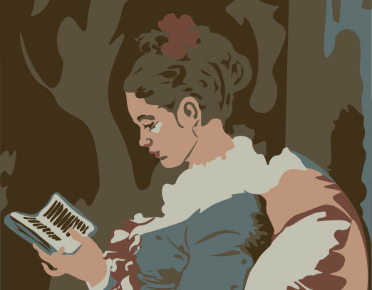
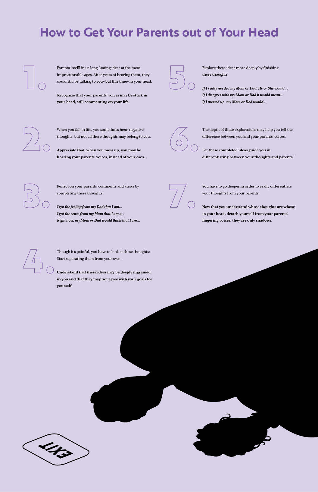
The most challenging aspect of the instructions side was first choosing an appropriate color palette for the problem, as it would need to fit the problem without copying the original video's colors. After watching the video, though, it seemed as though there were no better color choices than the ones already in use– what could express the power of parents in your head more than pink (for mom) and blue (for dad)? Instead of copying the pink in blue, I combined them, and I included a light purple in the design to denote the viewer as something new: a unique, different, and still impacted combination of their parents. I also chose to differentiate Mom and Dad's voices, like the video, but I chose red and blue instead, first. This proved to be too patriotic, so I would experiment for a while on what colors to use. Eventually, I chose black, white, and purple. The black and white could achieve the maximum-contrast, stark nature of what parent's views often appear like to their children while the purple could evoke the combination (red for mom and blue for dad) of the parents' power and presence in their children's minds. I chose a subtle purple, though, to visually echo the insidious way parents' voices often invade their children's minds.
Beyond color, I worked to achieve balance in the poster, seeking to harmonize the amount of visual weight of the text with the visual weight of the vector and white space. The decision to include the vectors, themselves, was multifaceted; it balanced out the text and cohesively reinforced it, specifically the last line of the text: they [the parents] are only shadows. In my final iteration, above, I also looked for balance in occupied space with white space, not overloading the cognitive load on my viewers.
As a psychologically weighty topic, each step was best proceeded by information that many in my audience might not know. I differentiated this information and the instructions, themselves, through spacing and bolding. This meant that, regardless of their background, my audience didn't read more than they had to: If the bolded instructions didn't make sense to them without the unbolded intro, they could go back and read the intro. On the other hand, if the instructions made sense to them without the intro, they could just read the bolded section.

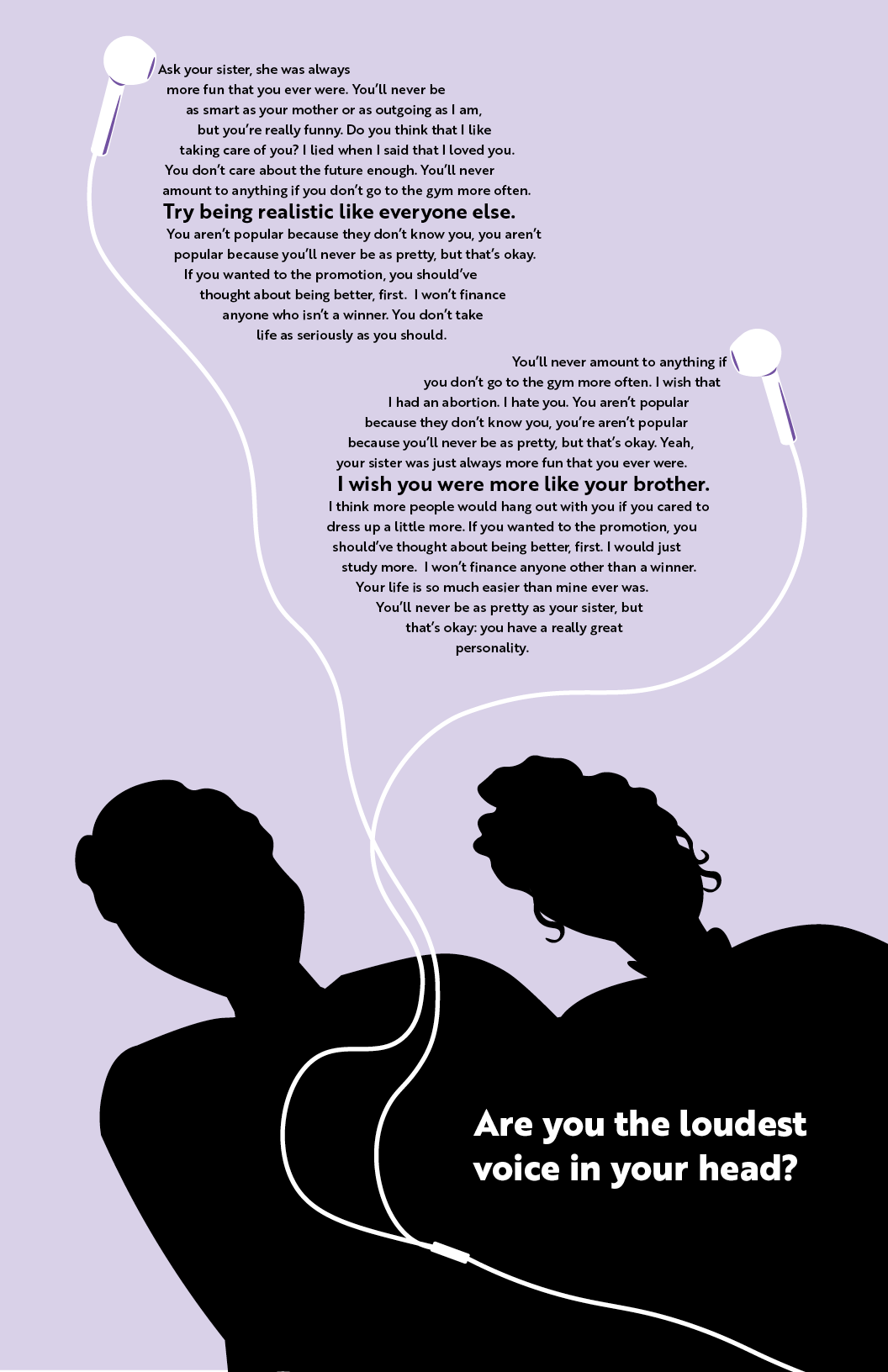
Where in the second side I had to juggle choosing colors, translating information, and balancing text with shape and image, I entered a completely new ball-game with first side of the poster: I would need to present the problem visually without condescending to my audience or confusing them. This next side of the poster would also need to cohesively follow the design language of the second side while communicating a slightly different message. First, however, I would need to identify what the message of the first side was by asking what the second side solved.
If the instructions solved the problem of how to get your parents out of your head, this exposed the problem that needed addressing in the first side: that you aren't the loudest voice in your head. But how could I translate this visually without saying it outright?
I needed to isolate and appeal to my audience's shared emotional experience. During the iteration process, then, I tried to evoke the familiar feeling of having someone else's loud voice stuck inside through vector hints and light text. I tried to do this by leaning into the act of hearing, instead of creating images of parents stuck in your head through simple vignettes like the video did. In the final iteration, I repeated the eerie, high-contrast shadows of parents from the poster's second side to help to reinforce whose stark voices are loudest while only vaguely connoting parents. I also intended the vector to brings dimension to the otherwise 2D scene and balance out to text heavy upper-half. As a secondary hint, I included the parents' negative comments in comic-like word bubbles that suggest someone else's voice in your head, too.